On-Set Production – Creative Exercise 2
On-Set ProductionPart 1 – Production Design Project
Our Inspiration – Nostalgia for the Past in the Present Moment
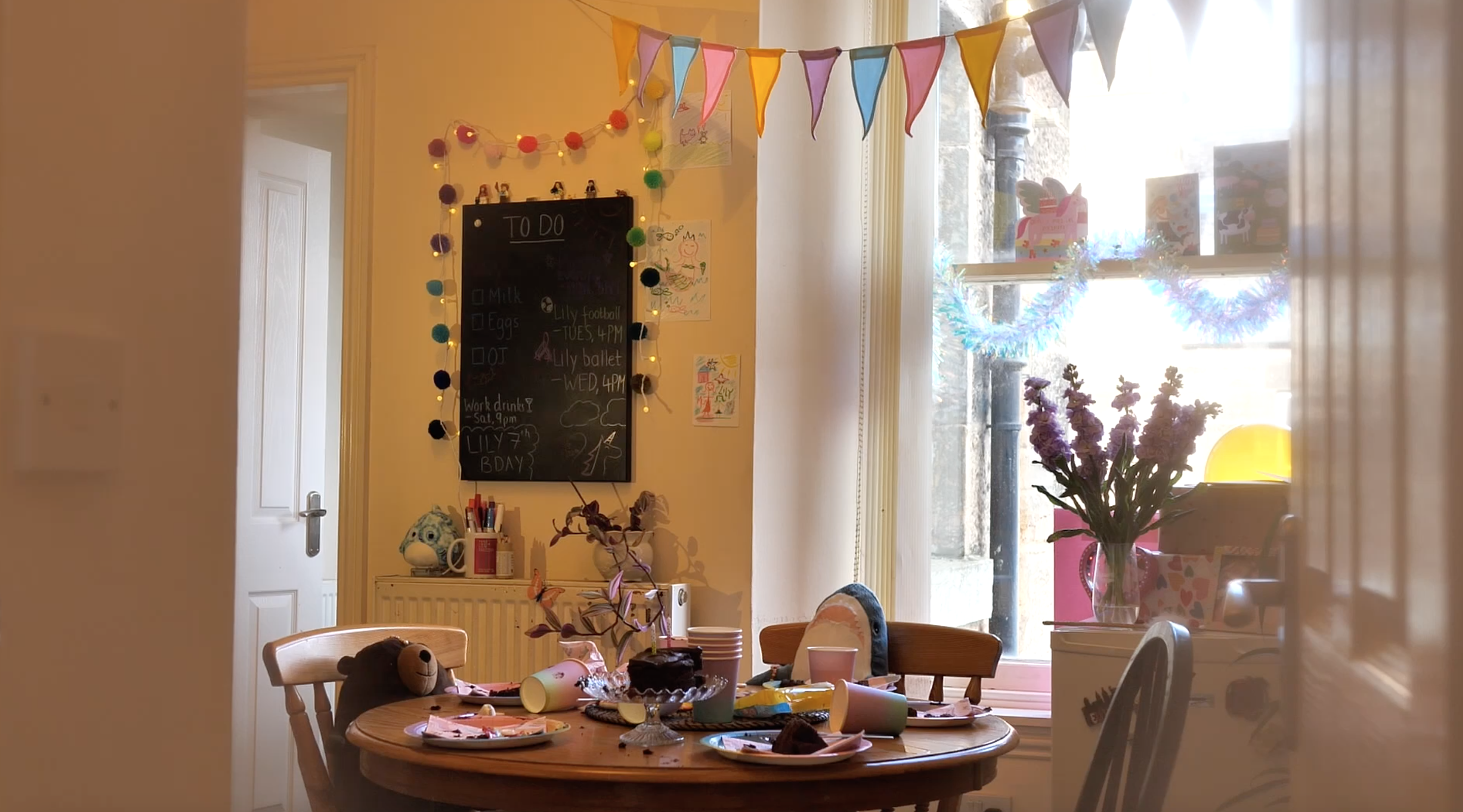
Oliwia and I decided to create a short film in response to the brief. Our story follows a single mum finding the kitchen in a mess after her 7-year-old’s birthday party has moved to the living room. We aimed to capture the bittersweet nostalgia of witnessing your child grow up and realising they won’t be a kid forever. We transformed our flat kitchen into the aftermath of a birthday party through use of party decorations and some deliberately smeared chocolate cake, strewn sweets, and spilt juice. We discussed that this could be a memory the Mum has of cleaning up after Lily’s 7th birthday party, and that motivated some of our creative choices in cinematography and production design.
Technical Details
We shot on my Panasonic GH5 II with a 18-35mm Sigma zoom lens, and to add a soft, hazy, vignette effect we put sheer tights over the lens and cut a small hole in the centre to maintain an area of clarity and sharper detail. Some of the shots follow this visual aesthetic less consistently due to the selected aperture and natural light interacting with the lens – which made the tights more visible in-camera. We aimed for consistency, but as this project was created within a few hours we were under time pressure and prioritised getting the shots we needed instead of dwelling on minor inconsistencies – however, we could have found a way to standardise the way the shots looked by practicing beforehand. The effect the tights added were a great choice in my opinion, as they created a dreamy, hazy look that mimicked a memory.
Set-Up
The sun position was on the opposite side of our house when we came to shoot at mid-afternoon, and with a lot of cloud cover overhead, the view out of our kitchen window appeared mostly white. This was emphasised by our choice to shoot in lower f-stops to create a narrow depth of field and focus on details as you would when committing an event to memory.

However, this worked for our story and character motivation. The Mum doesn’t want to look to the outside world, and instead stays focused on the world of her house and her little girl. Oliwia compared it to when you recall a memory, but can’t quite remember what the weather was that day.
For set-dressing, we worked together to create a believable kids party. I did most of the cinematography, whilst Oliwia took the reins with editing and sound design. The addition of the muffled sound of kids playing in another room really added to the atmosphere of our film. To achieve this Oliwia played about with EQ. Towards the end when we hear a door open, the muffled effect is removed to show they’ve left the room they were playing in.
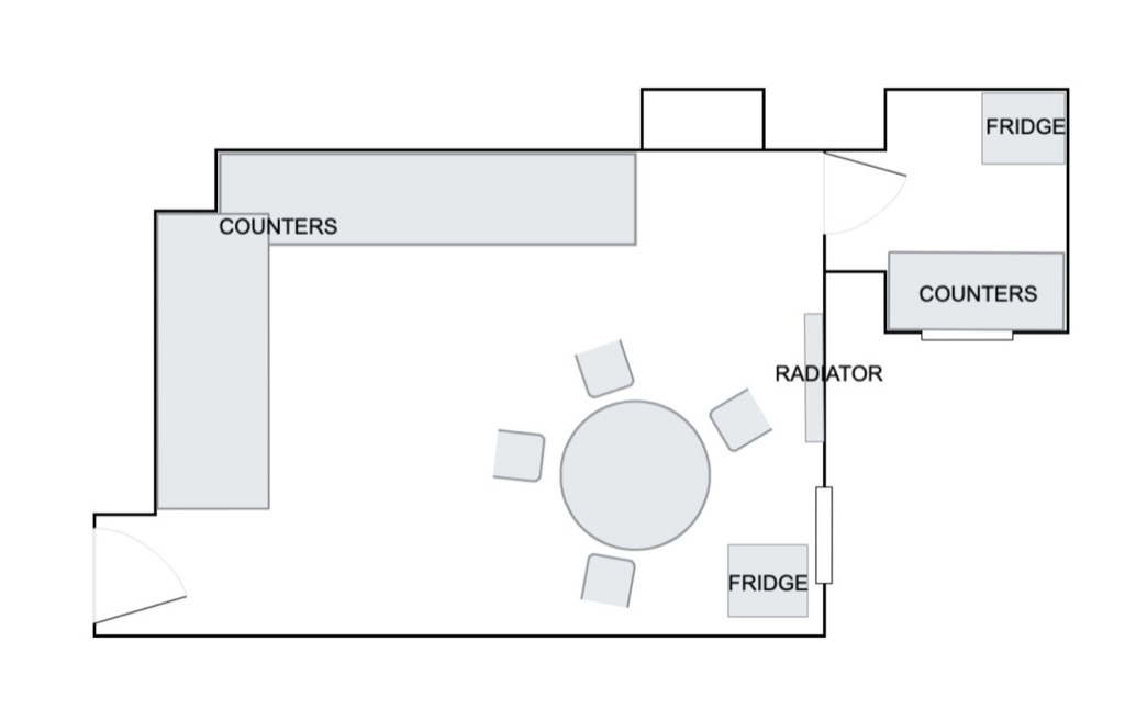
Above is a floor plan for the kitchen that Oliwia made.
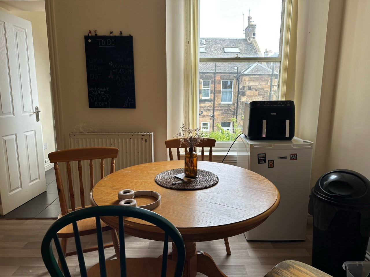
Above is a photo to represent how our kitchen normally looks.
Lighting
We didn’t have any professional lights for our shoot – neither of us own any unfortunately – so we used natural daylight and two warm-toned lamps to evenly light the kitchen. One is positioned overhead in the form of a practical lamp – our kitchen light – and the other was pointed at the blackboard as that part of the room was in shadow. The shadows were an inconvenience, but allowed for some creative shots using silhouettes – an example being Oliwia’s shadow over the blackboard.
Production Design
Oliwia and I put a lot of effort into the production design element. We went to our local big Sainsbury’s and stocked up on birthday party goods for a hypothetical 7-year-old girl after planning out what we needed to secure.
- Birthday cake – chocolate, so it’s messier.
- Balloons – pastel.
- Haribos or party-style sweets.
- Napkins – to crumple up and put on paper plates.
- Paper plates – it isn’t a kids party without them.
- Paper cups.
- Birthday candles – we burnt these to look like they’d been lit to sing happy birthday and then blown out again.
- Birthday cards – one with a unicorn, a mermaid, and farm animals.
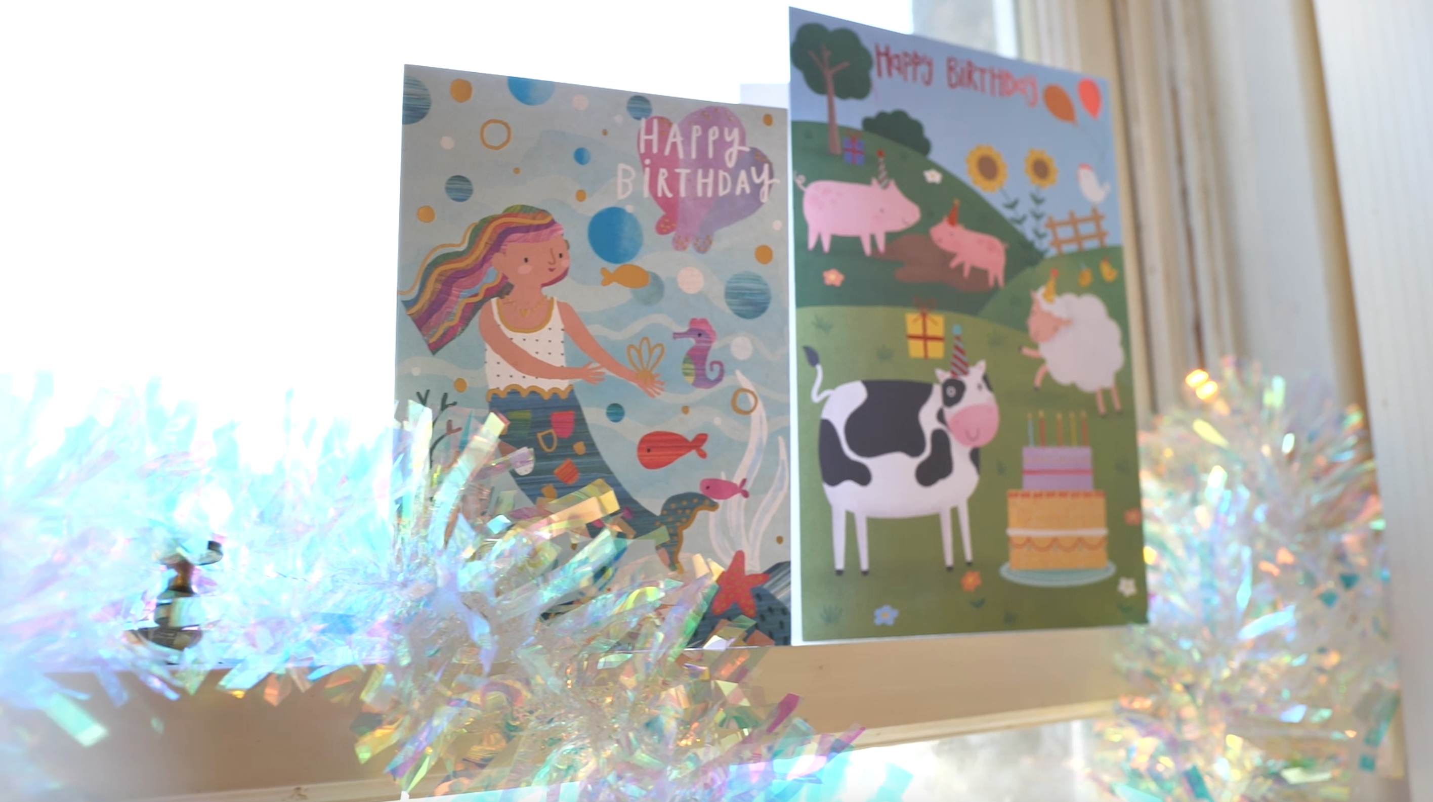
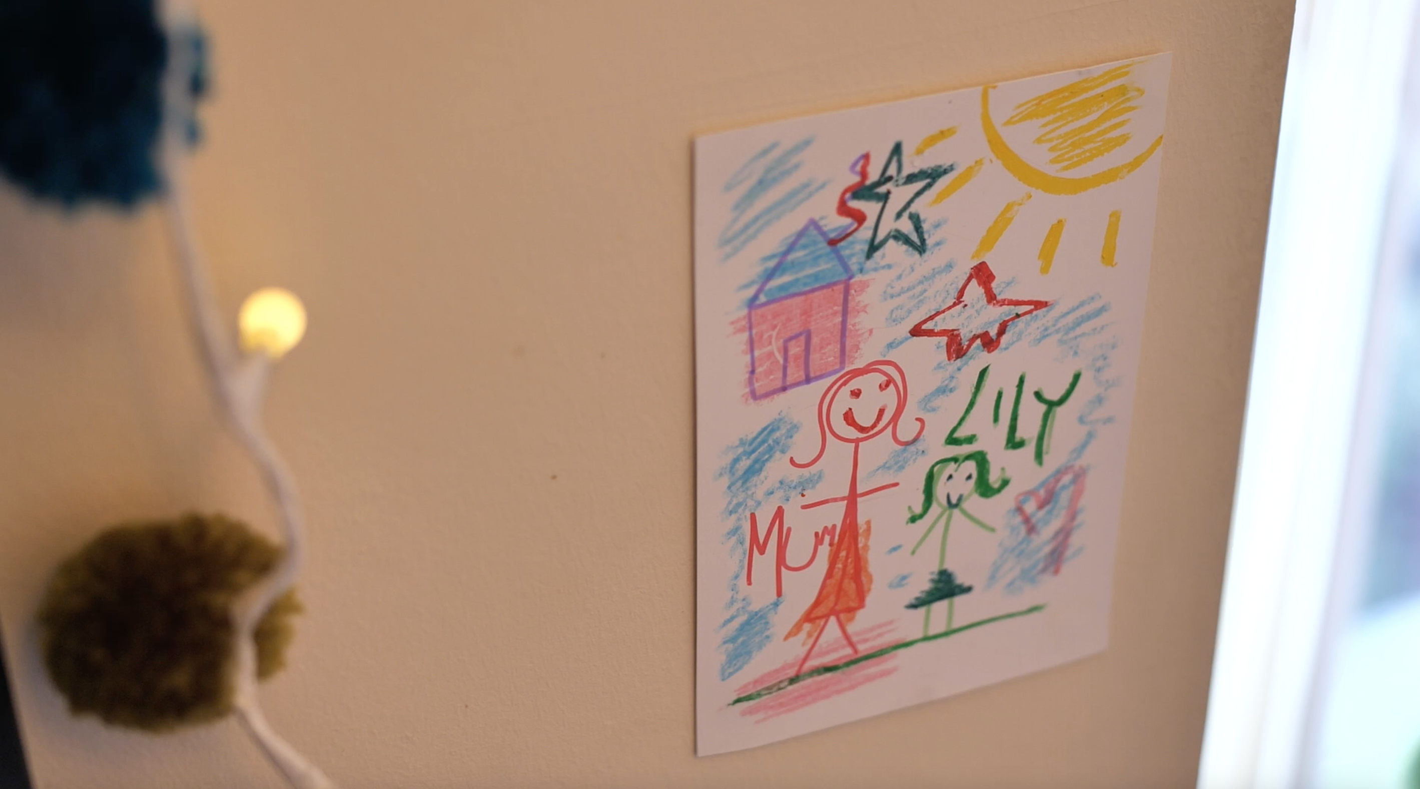
We also used what we already owned – stuffed teddies, fairy lights, gift wrap to cover cardboard boxes to make ‘presents’. Oliwia got out the crayons and oil pastels and drew stereotypical ‘little kid’ drawings which we stuck to the wall. I scrubbed our blackboard and then wrote things I thought a Mum would want note of – a shopping list, after school activities (like Lily’s football and ballet classes), and did some fun drawings.
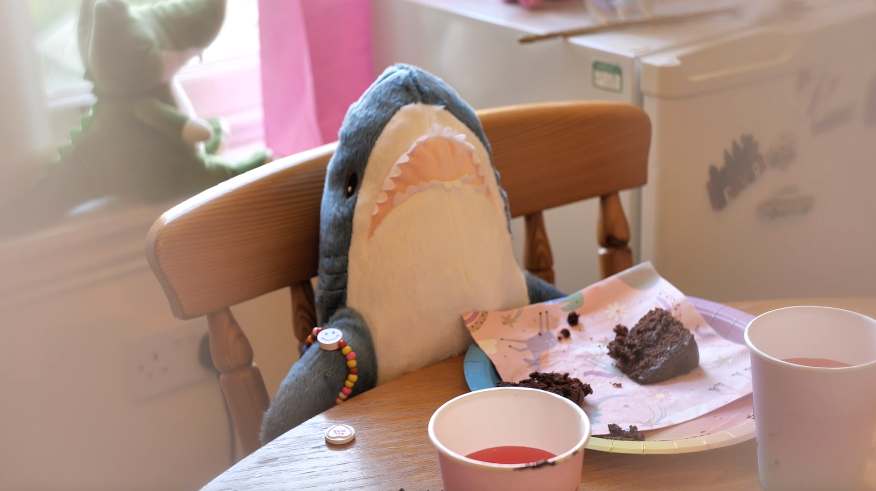
To make everything messy and like a bunch of 7-year-olds had been there, we smeared chocolate cake everything, scattered sweets, dropped things on the floor, spilt juice… Luckily we made the clean-up part of our film! To make the kitchen look more lived in, we found fridge magnets and moved our plant next to the fridge. Oliwia changed into a cream wool cardigan to look more ‘mum-like’, put her hair up into a bun, and we were set.
Part 2 – Magazine Excerpt and Notes
I chose to do an article from the Set Decorators Society of America as this creative exercise was more focused on production design and I wanted to learn more about it. After all, Andrew reminds us that cinematography and production design work symbiotically.
The French Dispatch
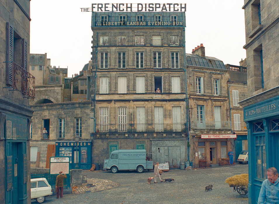
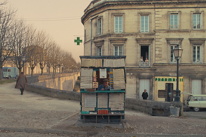
The French Dispatch was set in the fictional town of Ennui-Sur-Blasé and was intended to ‘evoke a Paris this is no more and maybe never was’, according to director Wes Anderson. This article follows the work of set decorator Rena DeAngelo and production designer Adam Stockhausen.
The town was intended to be both a post-war and pre-war version of Paris, not ‘shiny clean Paris’, but a ‘sootier, seedier, dirtier version with beautiful architecture, just not scrubbed clean’. The film follows an American magazine, The French Dispatch, in France and is told in a series of vignettes.
Prep
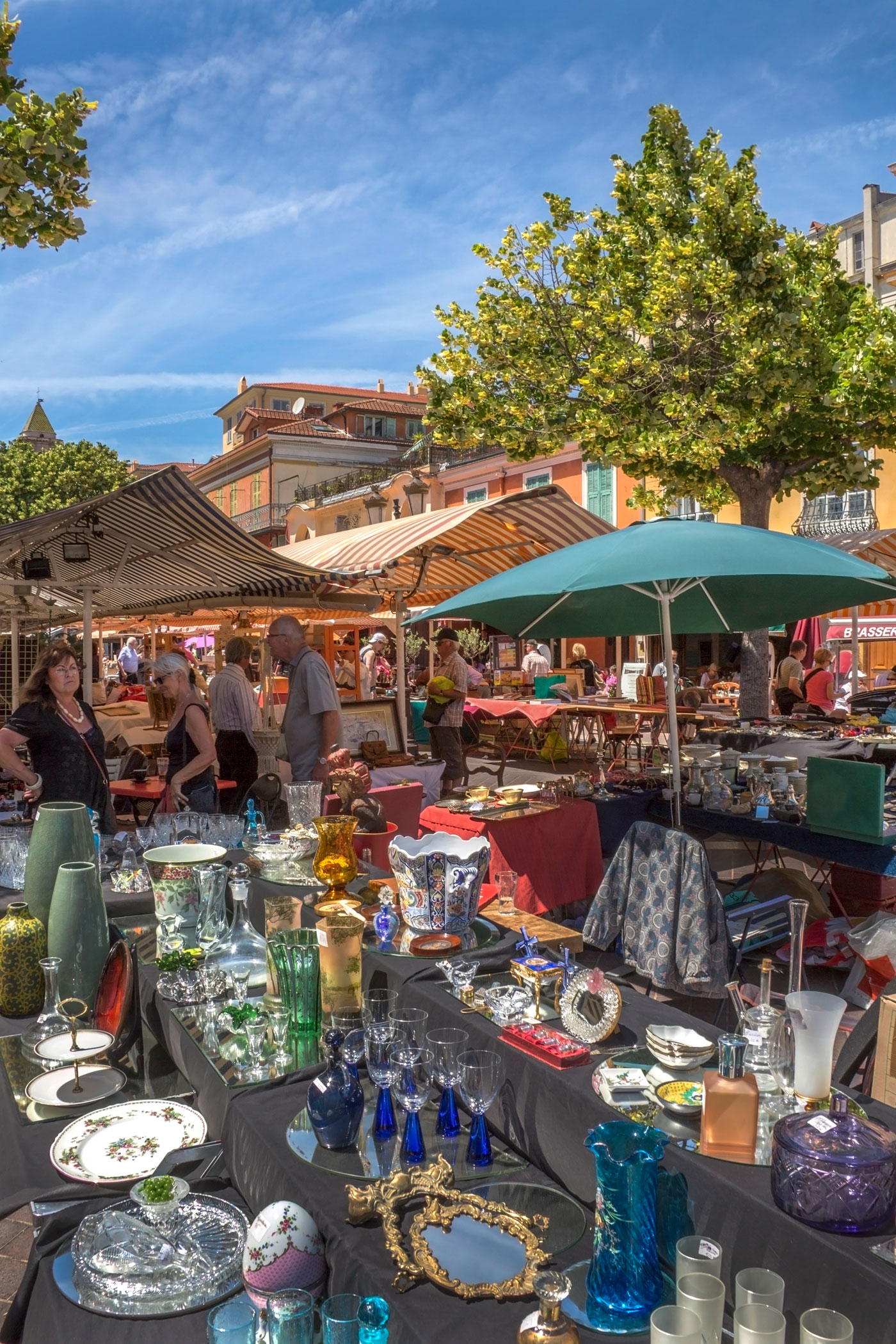
Preparations took six weeks in total. The production design department were mainly French, and took DeAngelo to flea markets, prop houses, and country shops to source set-dressing pieces for the film. The production was based in a small town called Angoulême, so one of DeAngelo’s assistants stayed in Paris to source for a few more weeks as resources would’ve been limited in Angoulême.
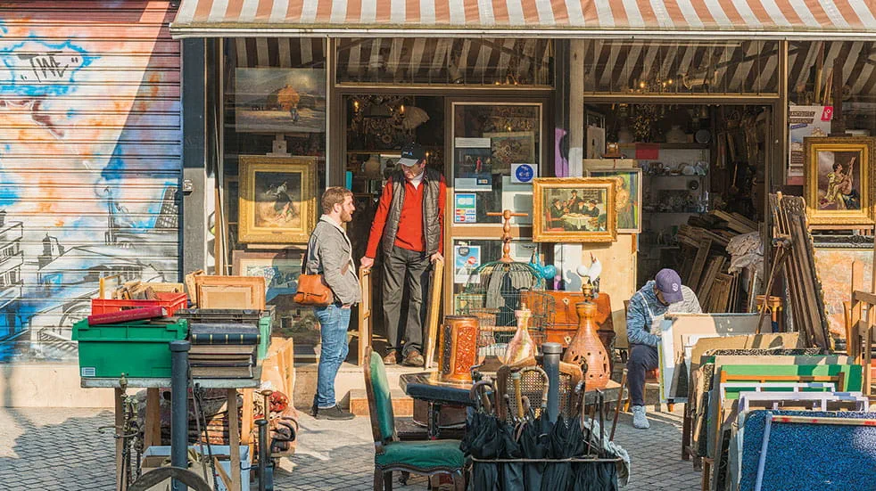
DeAngelo had two local assistants who managed to overcome the hurdle of being based in a small village and were able to source even the most obscure and specific items. One of their best resources was estate liquidator Denis Gargolie, with a warehouse that fit all of their needs. His job was to liquidate French homes of ‘their antiques, rugs, tableware, and lighting’.
Black and White Set Dressing
DeAngelo knew which scenes had been determined to be shot in black and white, and was tasked with finding colours that complimented each other in the black and white stock used by DOP Robert Yeoman. Not only did the set have to look good in black and white, it also needed to look good in colour when presented to Yeoman and Anderson on set.
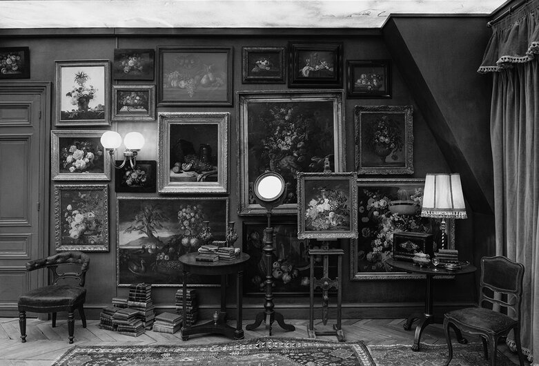
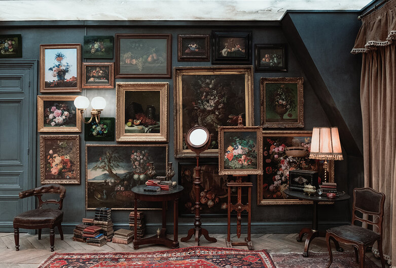
To achieve this set that was shot in both colour and black and white, DeAngelo used a filter on her phone when making creative decisions.
Combining Production Bases with Studio Sets
Outside of Angoulême was a felt factory which functioned as stages, offices, carpentry mill, paint shop, and set dressing storage. Not only did it provide a space for the construction of the sets, it also had three large rooms which became studio sets. All the sets were built at the felt factory, minus the interior of the prison which was situated in an empty factory outside of town.
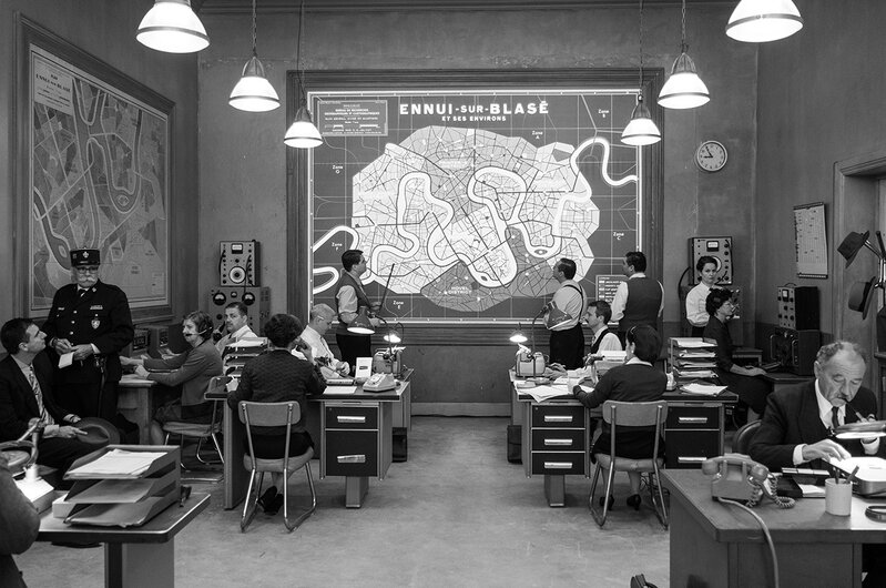
Anderson had every shot storyboarded ahead of time for the crew to continually reference. Several large sets were being dressed at once, and each set had to be taken done to create the space to build another.
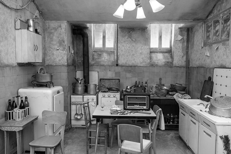
Set Descriptions
THE CADAZIO GALLERY
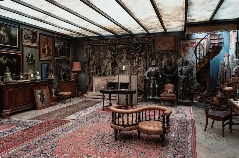
All of the artwork, tapestries, and armour was sourced from Paris prop houses. Anderson had 5 specific artworks he wanted to showcase, which DeAngelo managed to source. The tête-à-tête was sourced from England and reupholstered to match the one Anderson wanted.
LE SANS BLAGUE CAFE
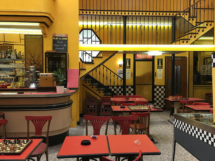
This set was inspired by 60s French films, but with a post-war focus through use of Formica, mirrors, and plastic – modernisation but in a less aesthetically pleasing way through combination of red and yellow, but not reminiscent of an Art Nouveau cliche Parisian cafe.
THE BARRICADE
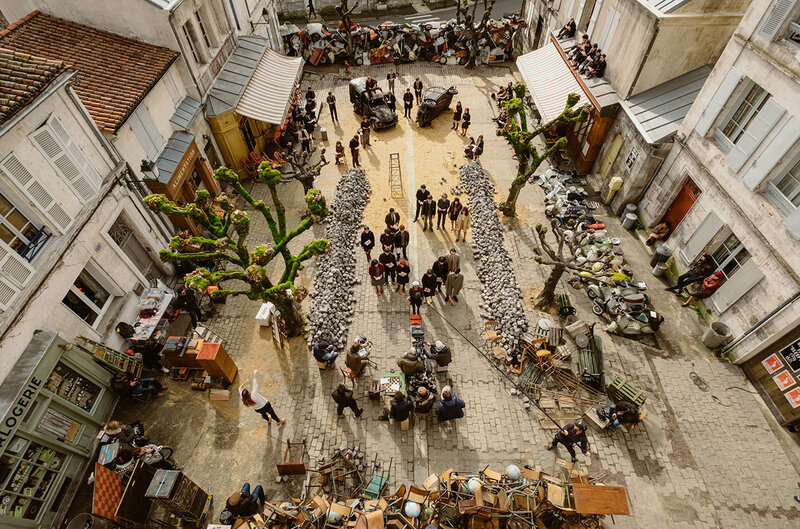
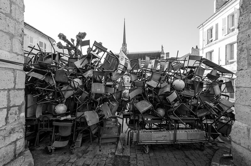
Set on a residential street, the two cafes were built from scratch and the street cobblestoned. Sculptors made rubber cobblestones for the piles and for throwing. The car barricade was built by the art department using actual scrapped car parts, and the other using school desks and chairs, globes, and typewriters. The resourcefulness of the crew is amazing. The barricade was also built on wheels so it could be moved.
THE DISPATCH OFFICES
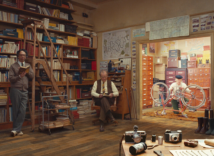
Each office was meant to represent the personality of each writer in one frame. Each writer/character was based on a real writer from the New Yorker magazine, so inspired the research for the production design team.
Takeaways from The French Dispatch’s Production Design
- Look for props in places you wouldn’t expect – flea markets, estate liquidators, and in other countries. Obviously most of these require major financing and resources to achieve.
- Don’t underestimate the charm and value of shooting in a small town – Angoulême provided the crew with everything they needed. The desired architecture, quiet streets, empty and spacious buildings… A production doesn’t always need to be situated in a major city close to an airport and with easy access to everything. Sometimes gems are found in the challenge of making it work elsewhere.
- The set decorator and the production designer work incredibly closely – and the work of a set decorator takes months prior to an actual shooting to achieve.
